Get Data Insights fast with Fectar Heatmaps
Visualise gazing activity and walking paths in Augmented Reality. Now you can create effective 3D Presentation: build fast, learn fast and change fast.
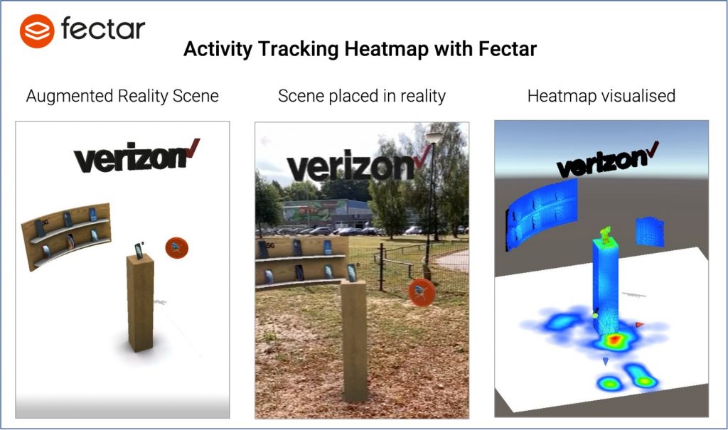
A heatmap is one of the commonly used techniques to directly visualise data. Heatmaps represent the magnitude of a certain phenomenon, for example how many users have viewed a particular object, in colours. The hue of the colour and intensity of the colour match the variation in intensity. Heatmaps make it easier to visualize and interpret complex data.